
SOS AIR
Apply AI · RSA Student Design Awards · 2023/24
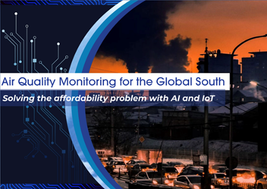
SOS AIR is a student concept to help low-income neighbourhoods affected by peaker-plant pollution, in this case Mott Haven in the South Bronx. It predicts when pollution will spike, so residents know when it is safe to go outside and when it is not.
This is a student proposal. Nothing in this presentation is installed, available or live. Visuals are mockups for illustration purposes.
Why Apply AI?
While researching air-pollution-related deaths I learned about peaker plants and how heavily they affect densely populated areas. I wanted to use AI to help solve that. It was also a way to challenge my problem-solving: could I build clear visual outcomes from as little visual information as possible, and shape the path I want to take toward becoming a UI/UX designer?
The Problem
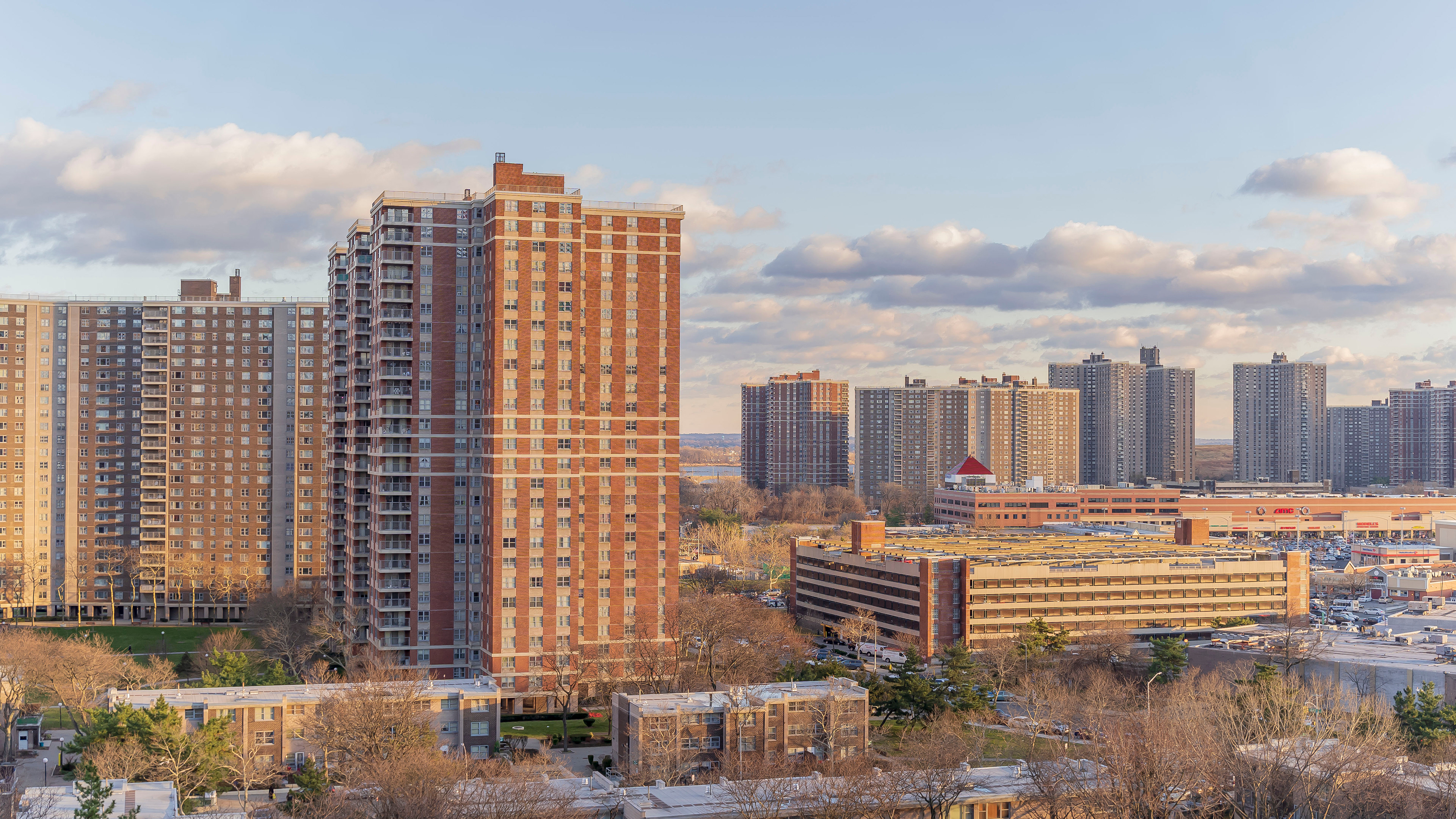
New York, one of the most densely populated cities in the world, has 18 peaker plants. For context, peaker plants are different from a nuclear power plant: they run on fossil fuels. Most of the time they sit shut off.
But when demand for electricity spikes, they act as an emergency source of fast supply to keep the grid from blacking out. The problem is that when a peaker starts up it releases high levels of gas emissions, NOx, SOx and fine particulate matter, into the air, polluting the whole neighbourhood around it and wherever the wind carries it.
That pollution lands on communities already overburdened, and it shows: in the South Bronx, childhood asthma hospitalisation runs at 432 per 10,000, nearly double the New York City average.
The Community
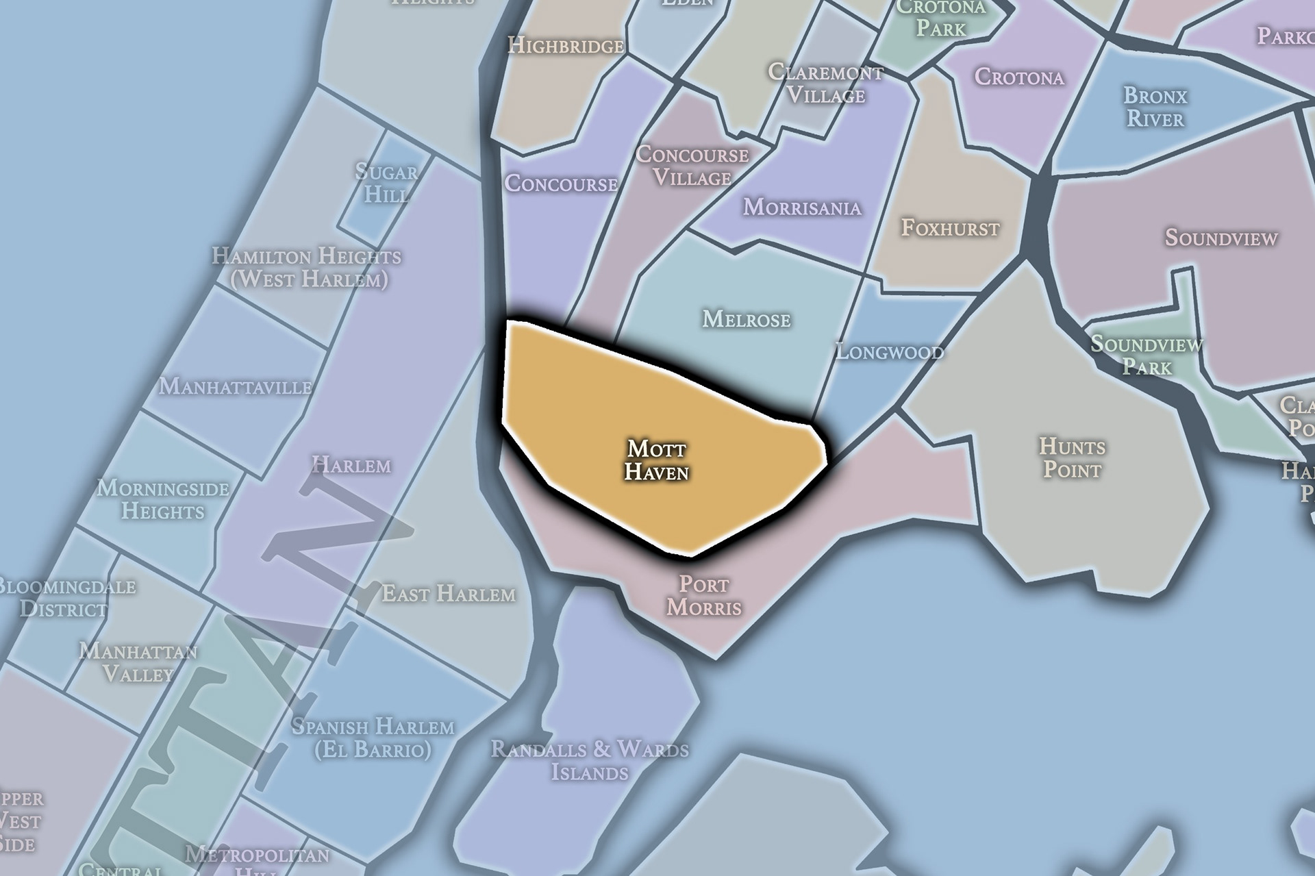
Mott Haven and Melrose, a predominantly Hispanic and Black neighbourhood in the South Bronx, is one of the densest and lowest-income areas in New York City. Median household income is roughly a third of the citywide figure ($27,360 vs $83,970), and the poverty rate of 42.6% is more than double the city's. These are the people carrying the effects of peaker-plant pollution, and while they are already overburdened, they have little political power to move the plants.
Two groups are politically active on this issue:
Together they represent the voice of residents in these neighbourhoods and push for a solution.
Precedents
1. Airqo, Uganda.
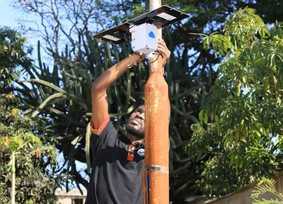
AirQo is an environmental-intelligence platform that pairs a dense network of low-cost IoT sensors with machine learning to fill urban air-data gaps across more than 16 African cities. SOS AIR borrows AirQo's blueprint: community-hosted sensor grids that bypass sparse government monitors, read pollution in real time, and feed an AI that turns raw numbers into simple public-health alerts. The key difference: instead of tracking macro pollution trends, SOS AIR integrates energy-grid data to anticipate peaker startups and tell the neighbourhood when it is safe.
2. AIMMLab’s AI_r System
AI_r is an air-quality monitoring and prediction system that pairs high-quality "master" sensors with cheaper "slave" sensors to map pollution over wide areas using predictive AI. SOS AIR adapts that low-cost, multi-sensor layout and uses AI to track how weather moves pollution through local streets. Where AI_r targets general air-quality forecasting, SOS AIR is event-driven: it links to the power grid to predict peaker startups, warns vulnerable residents before a burn begins, and gathers data that could help activists challenge the plants.
Concept + AI Utility
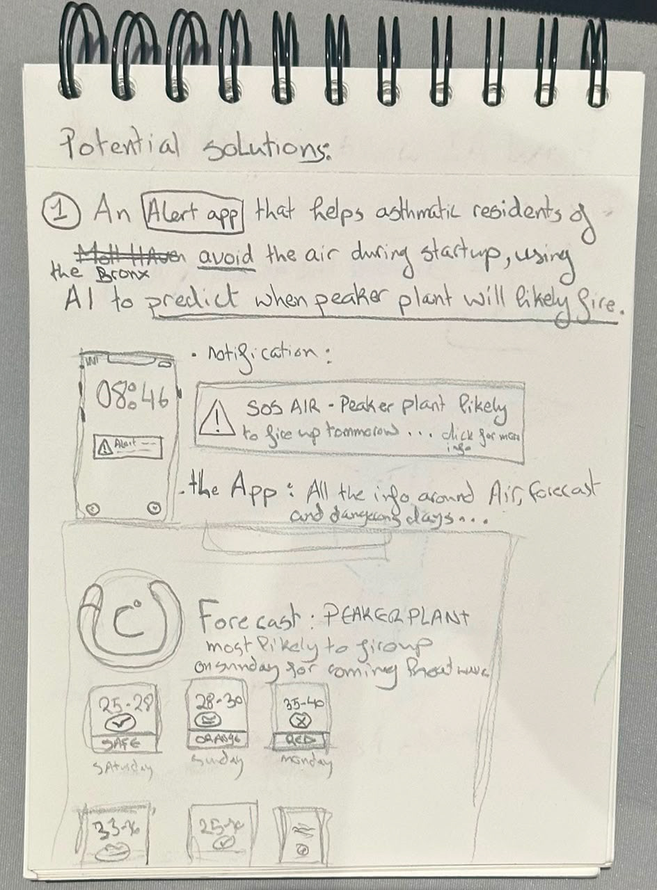
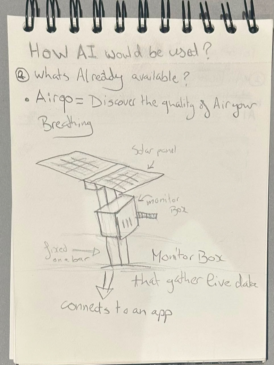
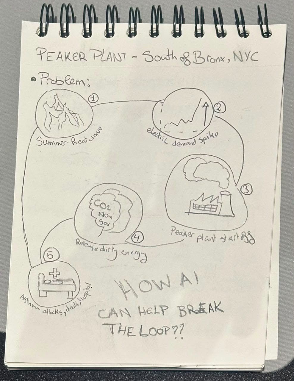
The concept is built around the core loop: demand spikes, peaker plants fire, emissions rise, and people end up hospitalised or with long-term breathing conditions. To tackle this I split the product into two parts, physical and digital.
1. Physical
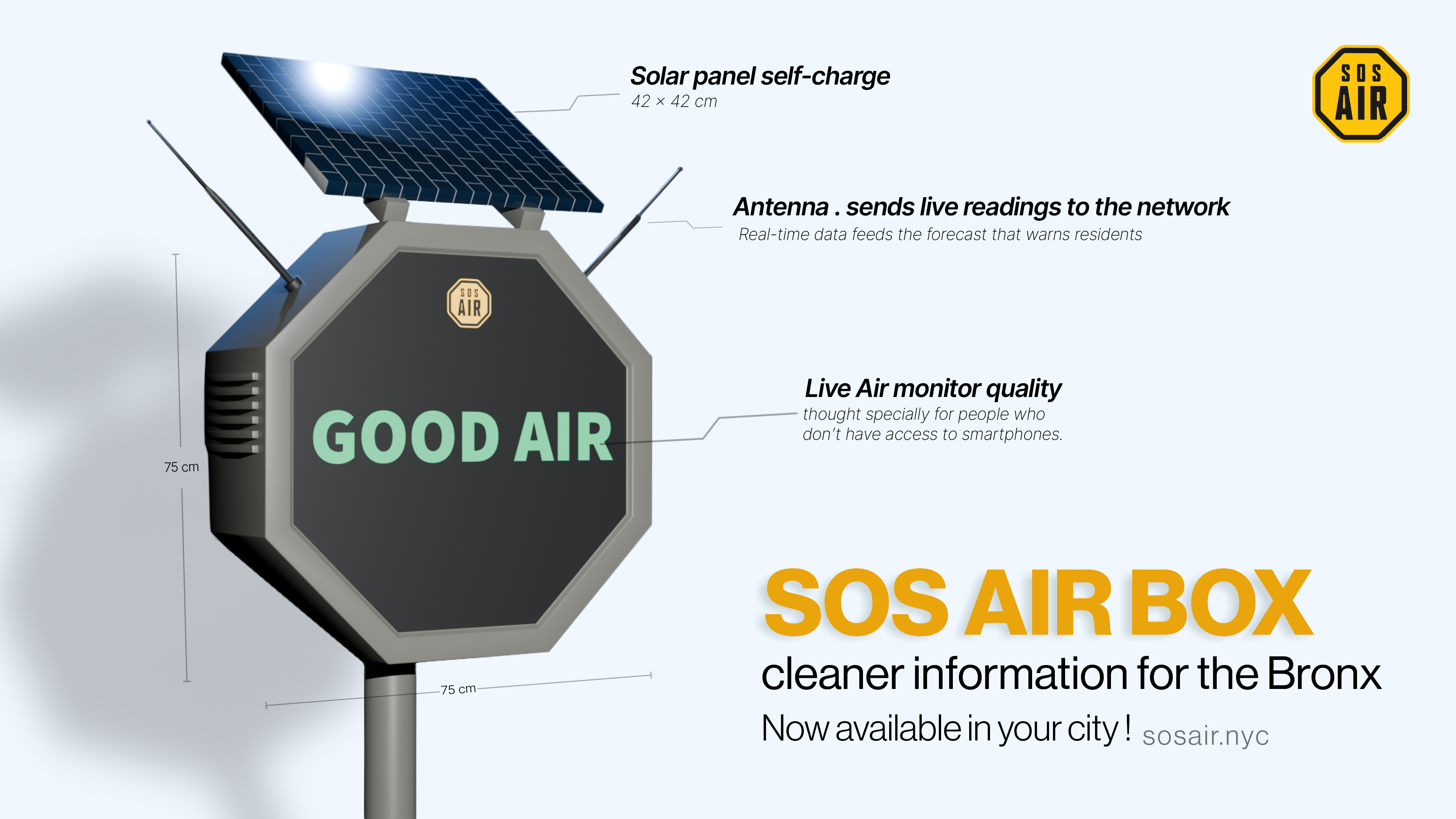
For the AI to work it needs proper data. I designed a prototype low-cost sensor box, installed across the affected neighbourhoods, that measures air quality in real time. That data is processed by a model trained to spot recurring patterns and turn raw numbers into clear information. Ideally, peaker plants would also flag when they are about to start up, though this is not essential.
2. Digital
The first output is an app with a simple front end anyone can read, giving a weekly forecast and an alert when conditions are about to change nearby. It uses a strict, alarming colour code when air quality drops and a calmer one when things are fine. For people without a smartphone or internet, the same information shows on interlinked public screens placed at key points, following the same colour code.
With real data and AI forecasts, residents know when to stay in and when it is safe to go out.
The Making
Part 1: The logo
As the concept came together I needed a logo. My inspiration came from New York's use of semiotics and alert shapes. I asked myself how someone recognises important information while outside, and started searching for visuals.
I landed on road signs, which are anchored in our behaviour as something to always look out for. I hesitated between a triangle and an octagon, and after testing both I felt the octagon was more original and gave me more space to work with.
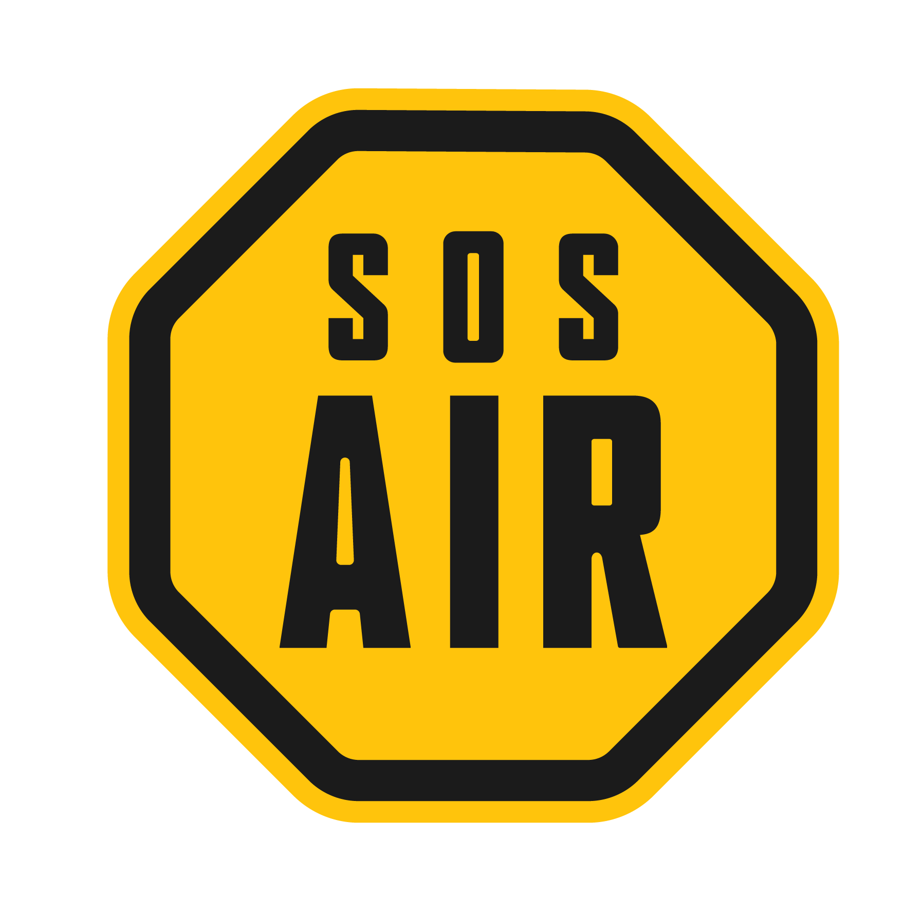
For typography I kept things simple, since consistency was my main goal. I laid out a lot of drafts to see how the name could play with the sign, and found that using the O in SOS as the dot on the i structured the name and tied it to the mark. The colour, again, is drawn from the urgent road signs seen across NYC and worldwide.
Part 2 . Sensor Box
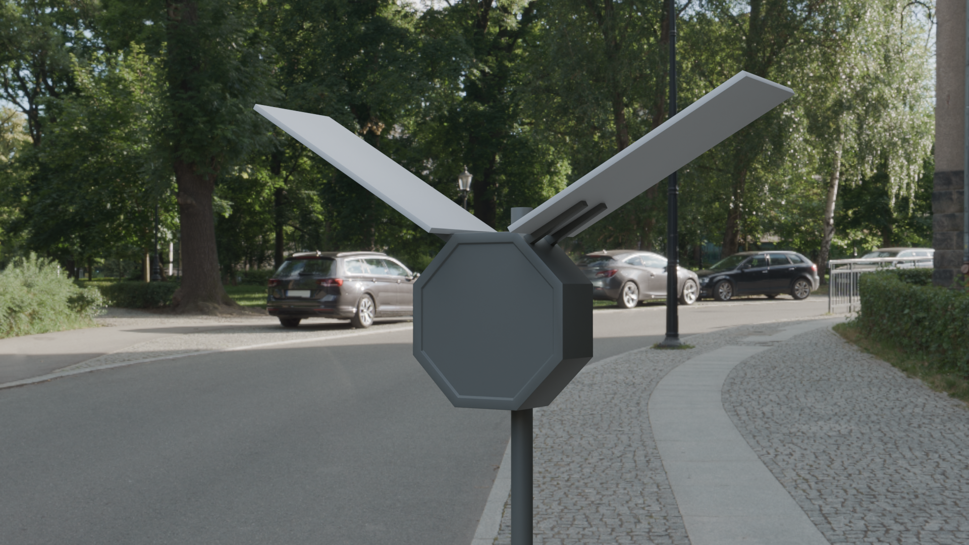

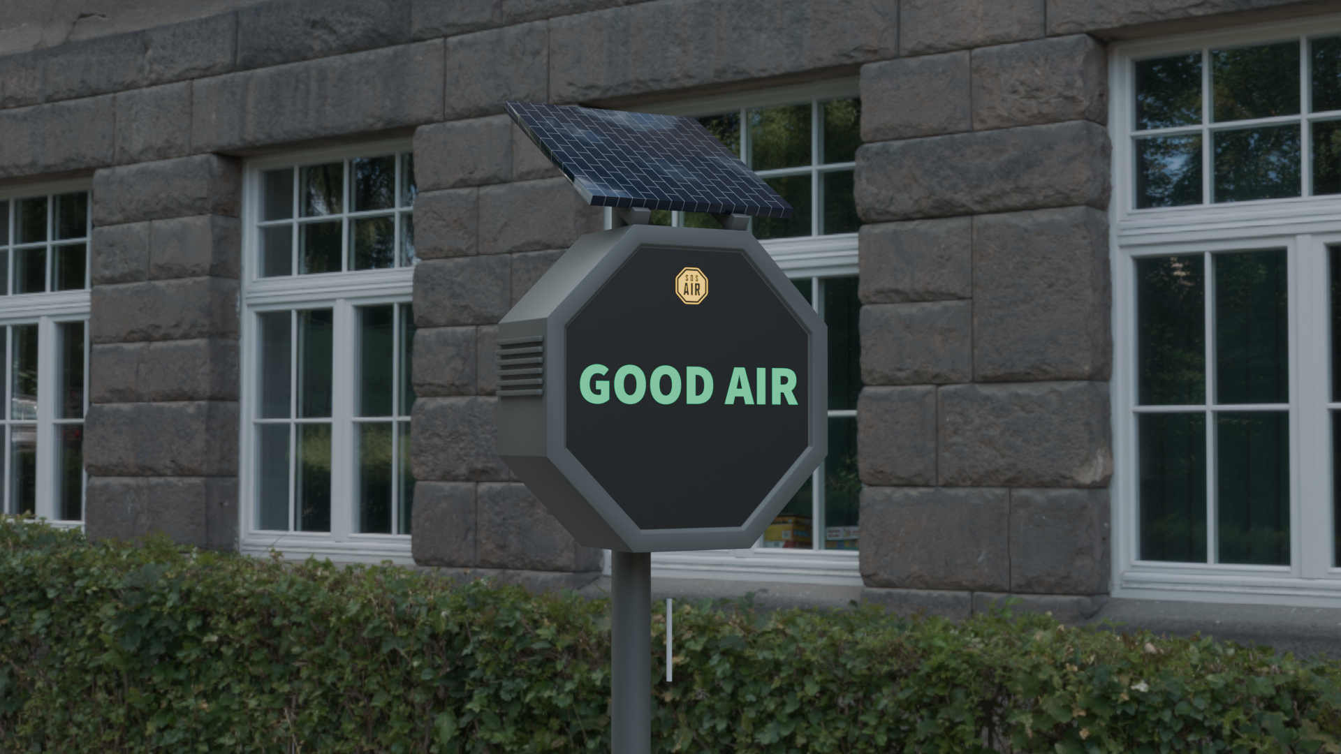
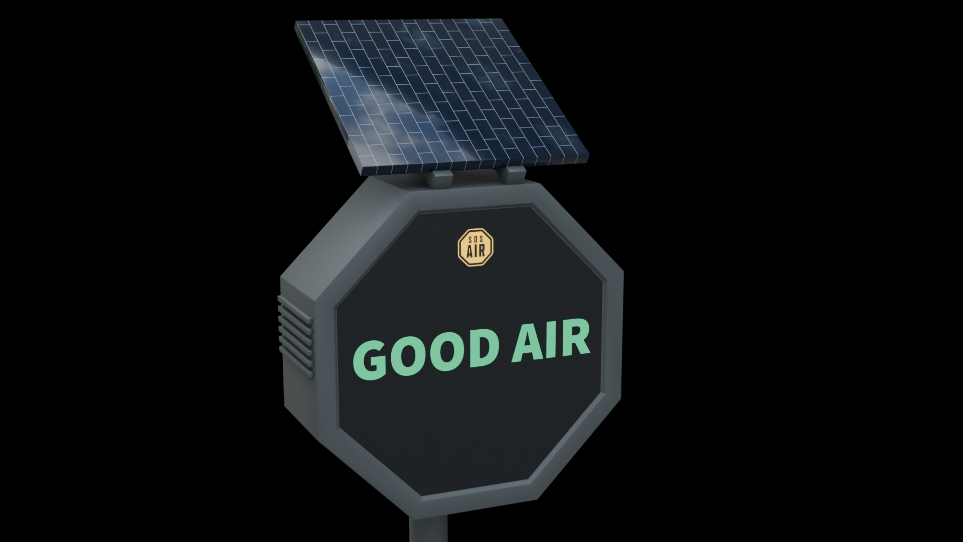
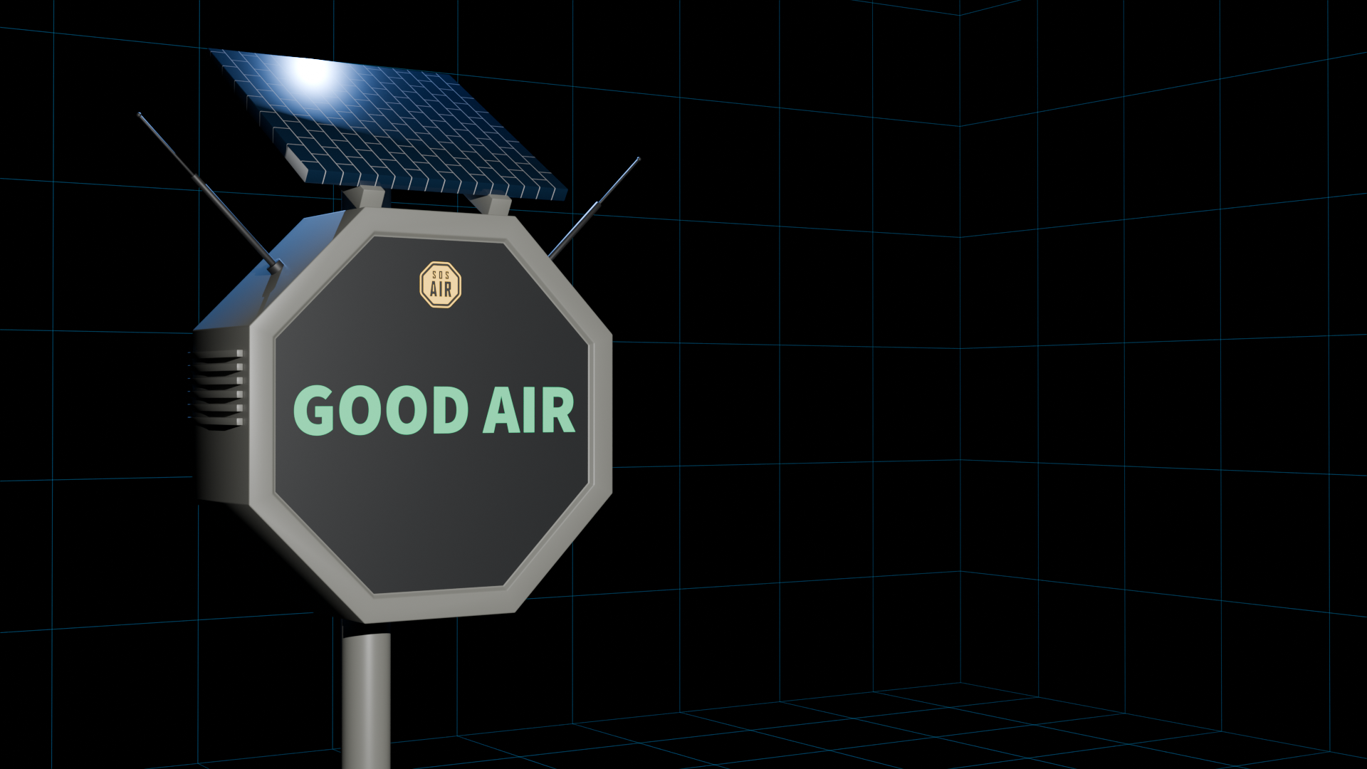
The box takes the same shape as the road signs, keeping it consistent with the logo and familiar against the objects around it. A solar panel gives it its own renewable energy, so it does not add to the electricity demand that causes the problem in the first place. I built the 3D prototype in Blender and went through several iterations before this shape, especially the solar panel: the first idea was a winged panel, but I made it shorter and more compact so it would not distract from the digital screen that shows the air condition in real time, green for good air, orange when something is wrong.
Part 3. Digital App Interface
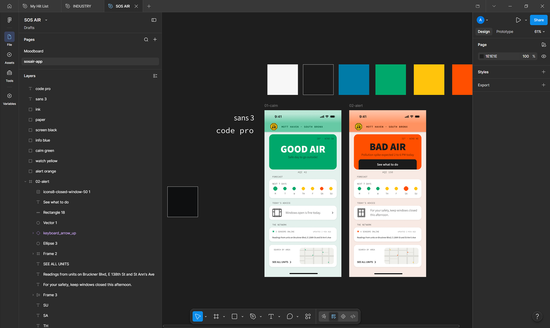
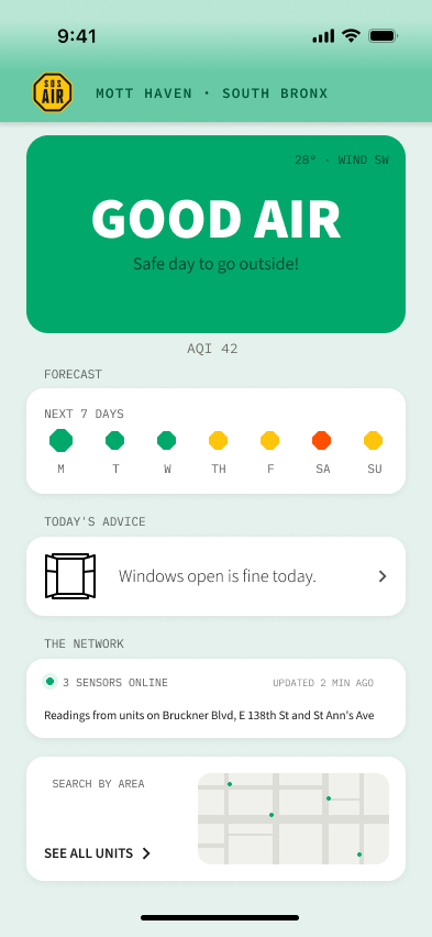
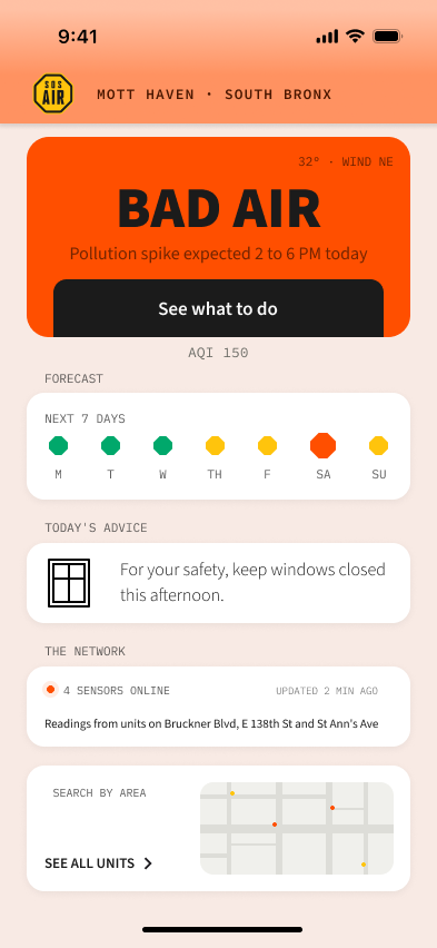
Following the same reasoning, and using the moodboard and design system I built, the last step was the interface, which I designed in Figma. It shows the important information first so residents can grasp their situation at a glance, and the colour change tells them instantly whether it is safe to go out or better to wait for cleaner air.
Marketing Campaign
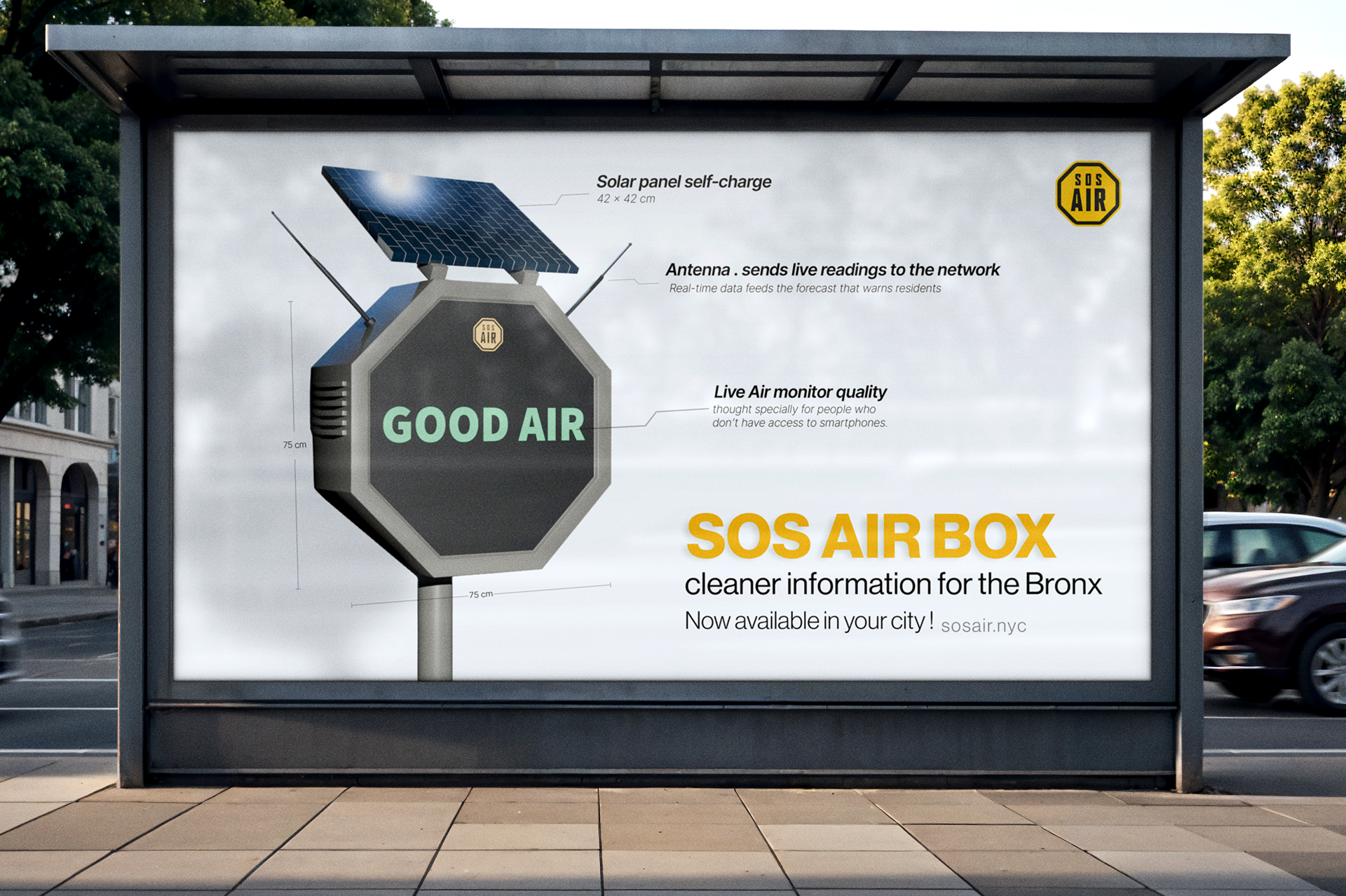
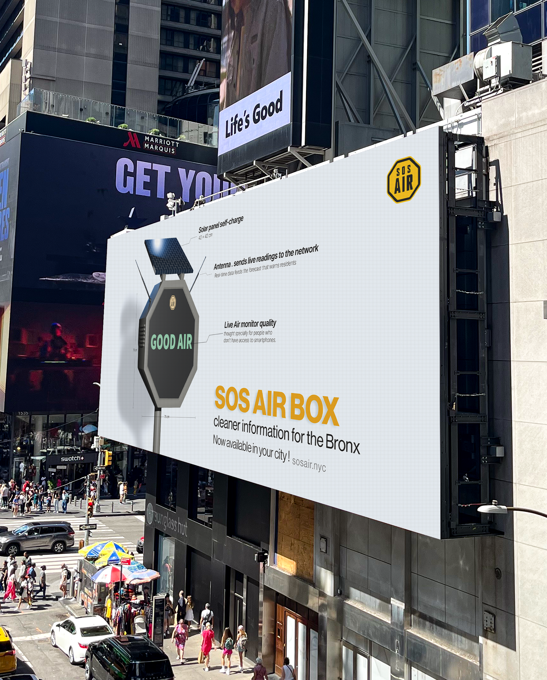
To imagine how SOS AIR might reach people, I designed a speculative campaign set in the streets of NYC, showing how the concept could be communicated to the community and what it would look like in their environment. I placed each outcome into its own real-world context, so you can picture how it would be seen and used if the product existed.
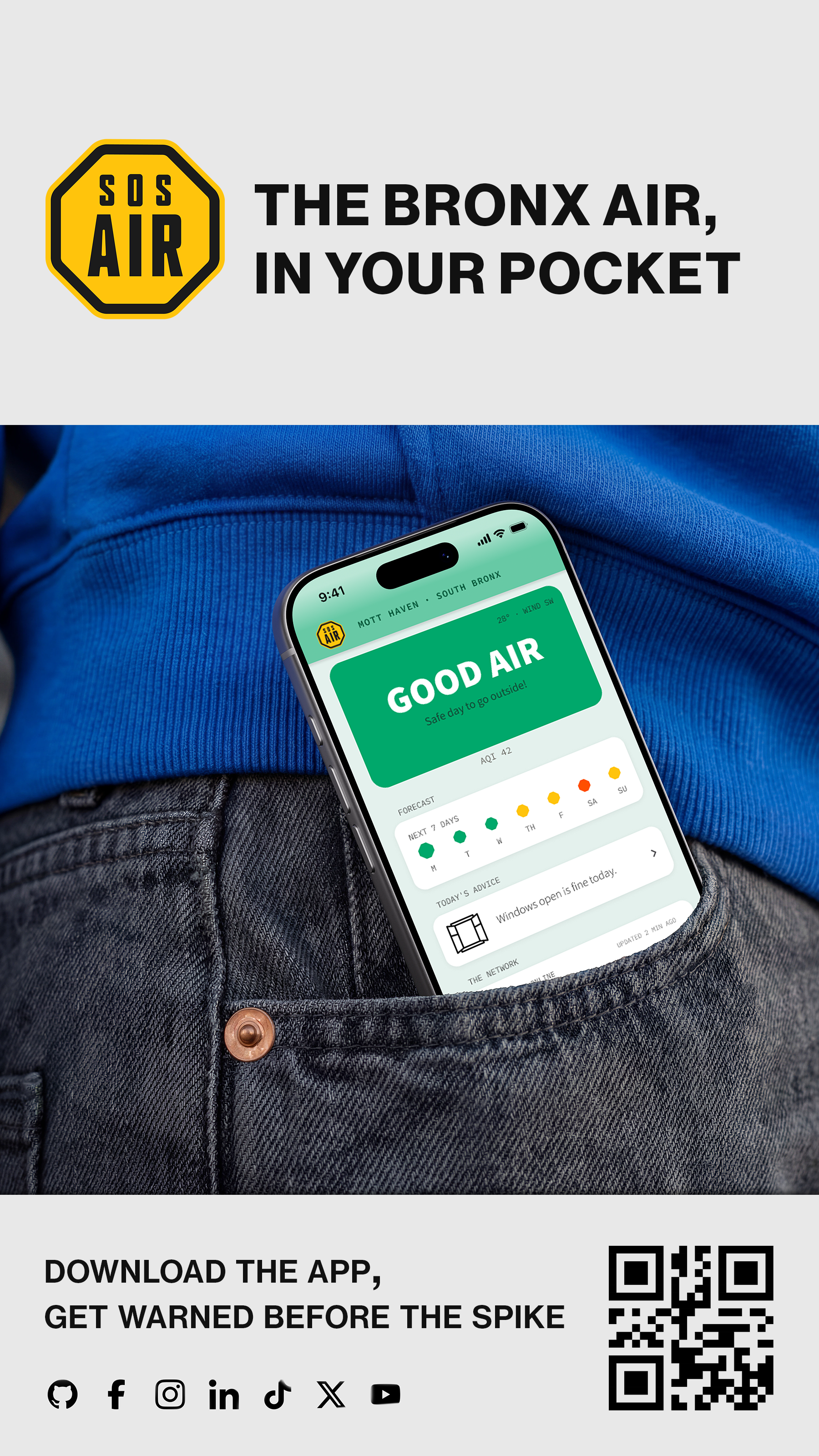
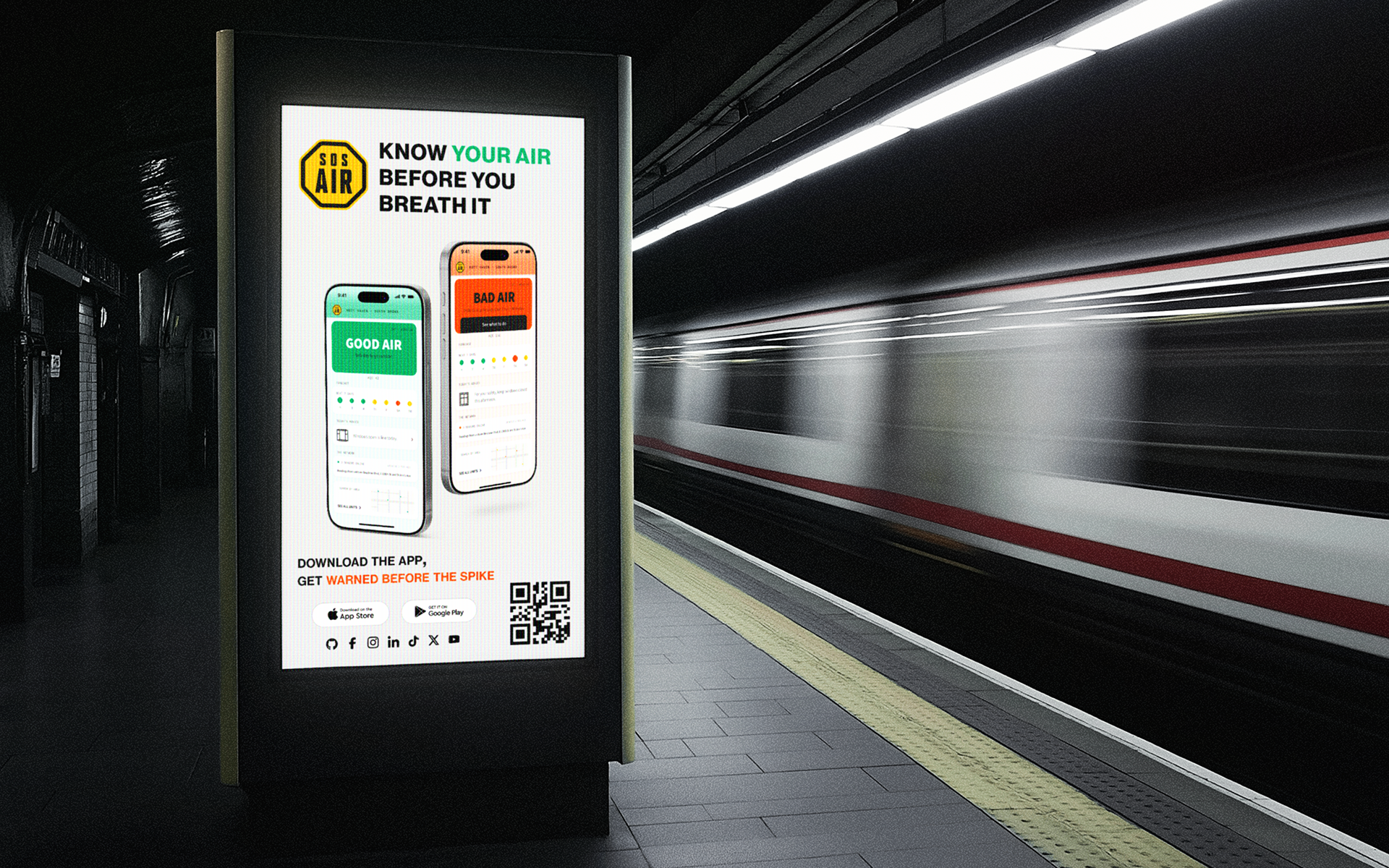
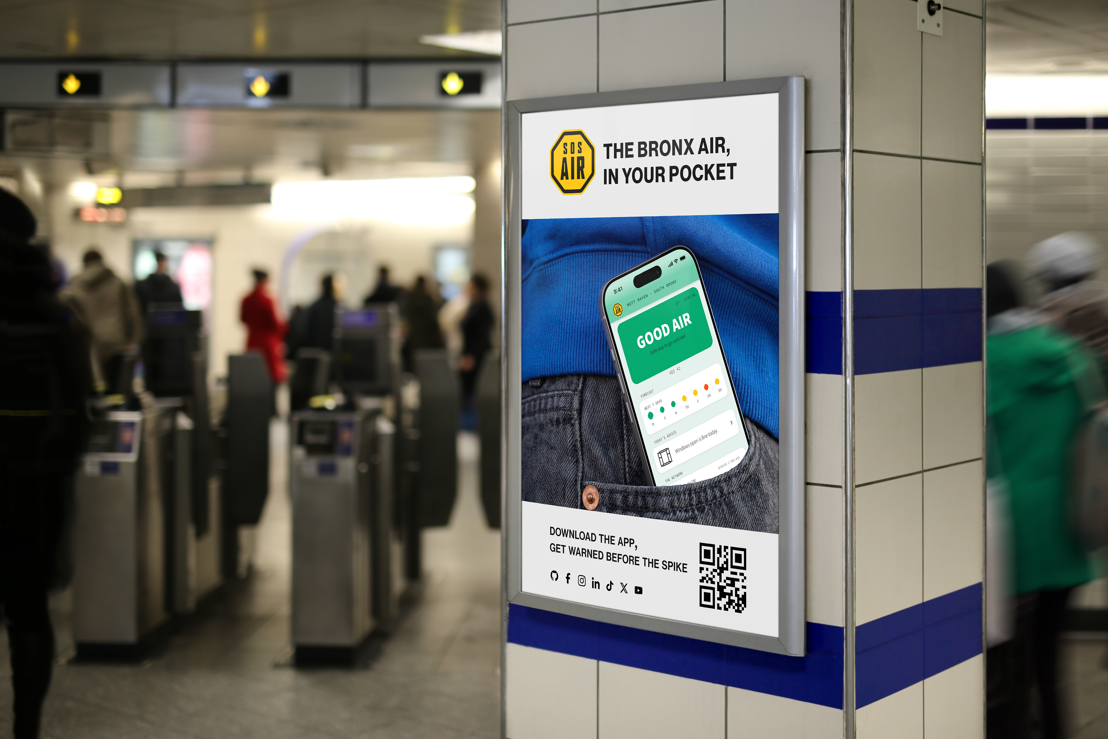
Showing the app and the physical box in context makes the idea tangible and helps people understand how the system would work and the new object they would meet around their neighbourhood.
Conclusion
This project let me practise problem-solving, but it also taught me to focus on human needs and shape solutions around them. With SOS AIR, the people of the South Bronx could imagine a better future for themselves and their children.
