Research
Introduction
This page is a compilation of the artists and portfolios that inspired me while designing my website.
Who I studied, and why
Ever since I tried making an interactive game in the FORM module, I knew I had to learn at least the fundamentals of coding, and researching that led me to his page.
His Web Interface Guidelines gave me a lot of useful, practical advice when building my own site.
The simplicity of Andrea's page, combined with his outstanding body of work, makes him a big influence to draw from and learn from.
He helped me understand what I did not want from my site: to look professional rather than relatable, keeping the site for visual outcomes and process while my social media stays more open and familiar.
His visuals speak for themselves, letting him keep a minimal but intuitive and insightful website.
Layout
Choosing between the different themes in Adobe Portfolio, my site first used a left-aligned navigation panel with the content on the right.
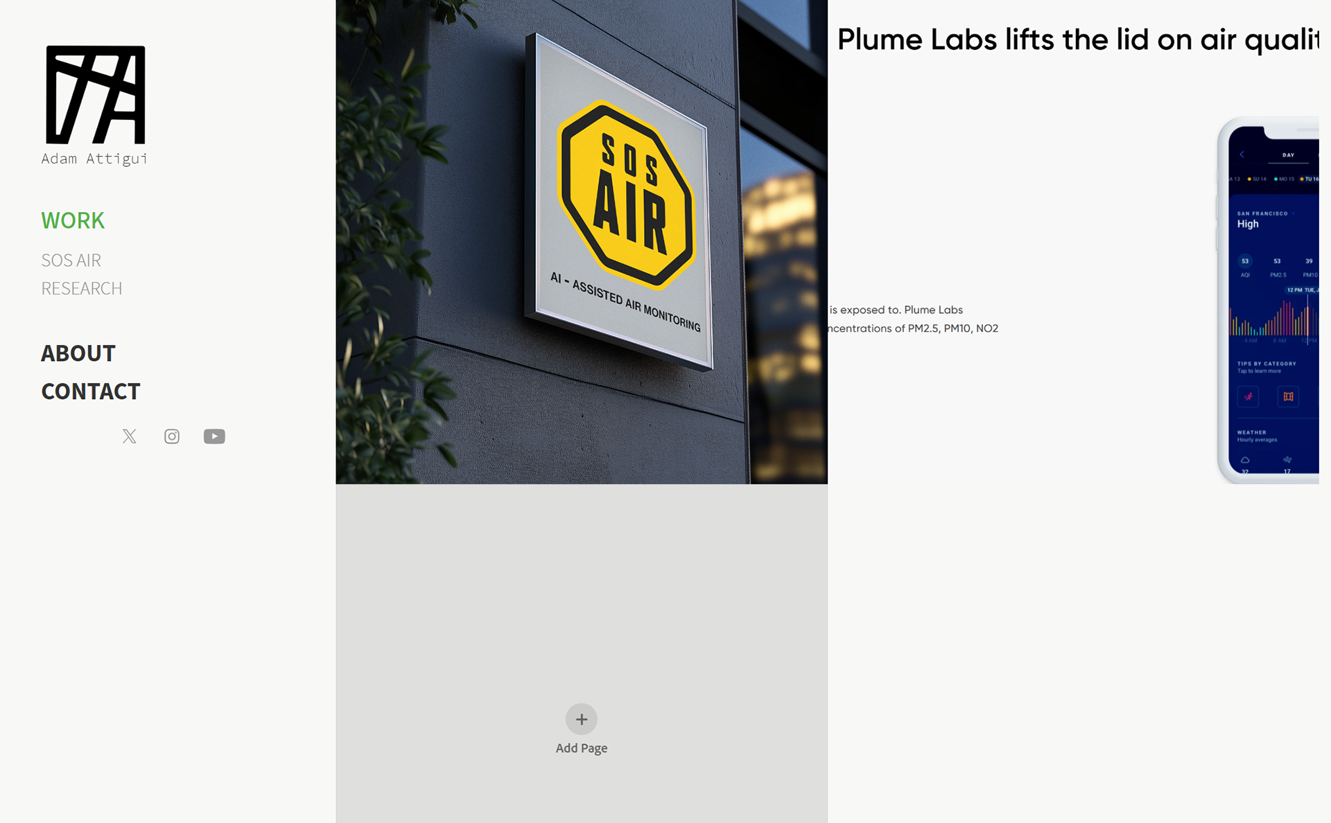
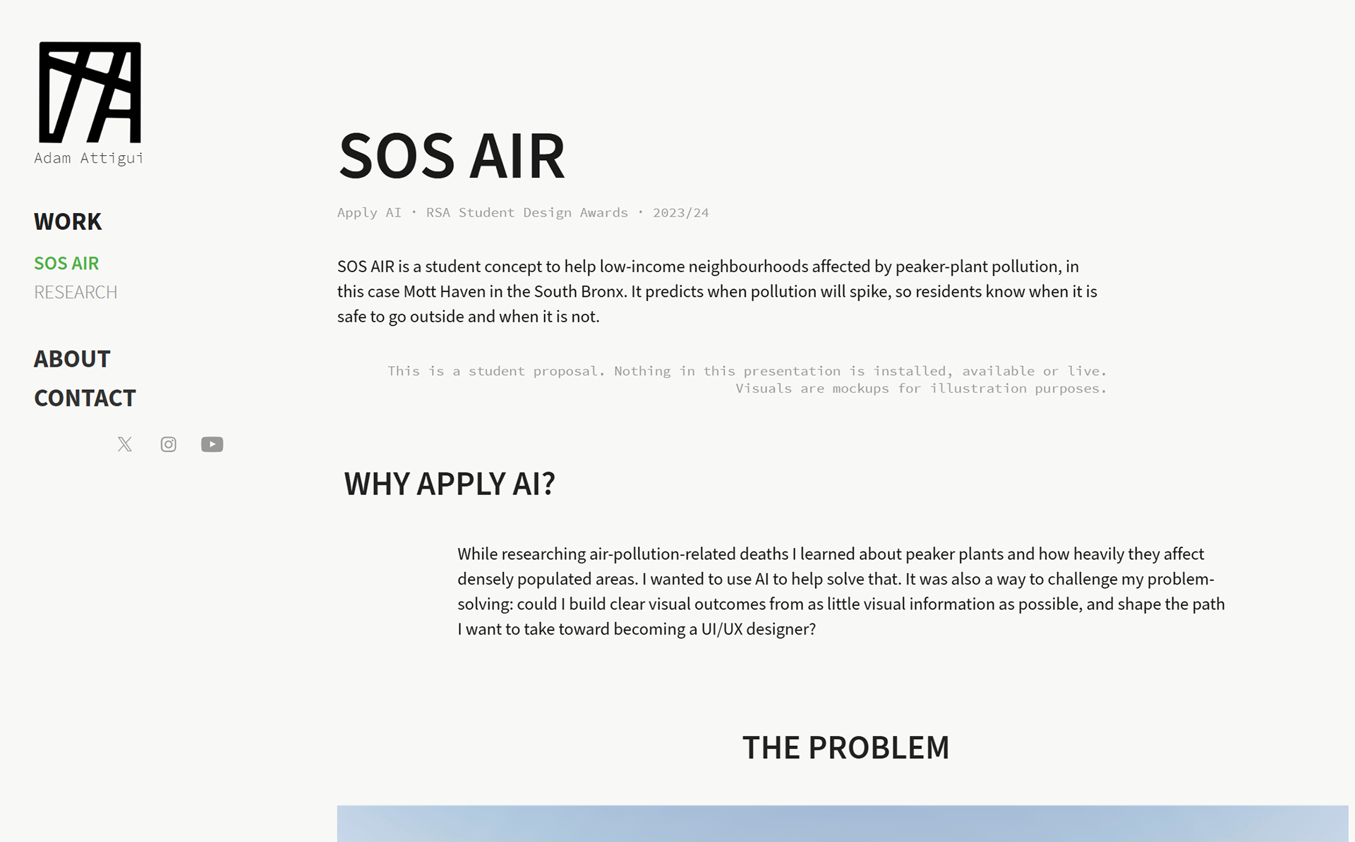
I felt the navigation was too distracting, and I noticed that as I scrolled the text stayed right-aligned and felt off. I moved to Andrea's approach and kept the navigation along the top, which gave the homepage and case studies far more breathing space.
Typography
I knew I wanted a UI-friendly typeface: a simple sans that reads easily across the site. My decision: Source Sans 3 for body and headings, Source Code Pro for labels and nav.
Why these? A simple sans lets the work lead and stays readable for non-designers, while the mono labels add a UI and system feel. Source Sans 3 was also designed as a UI typeface (Paul D. Hunt, Adobe, OFL).
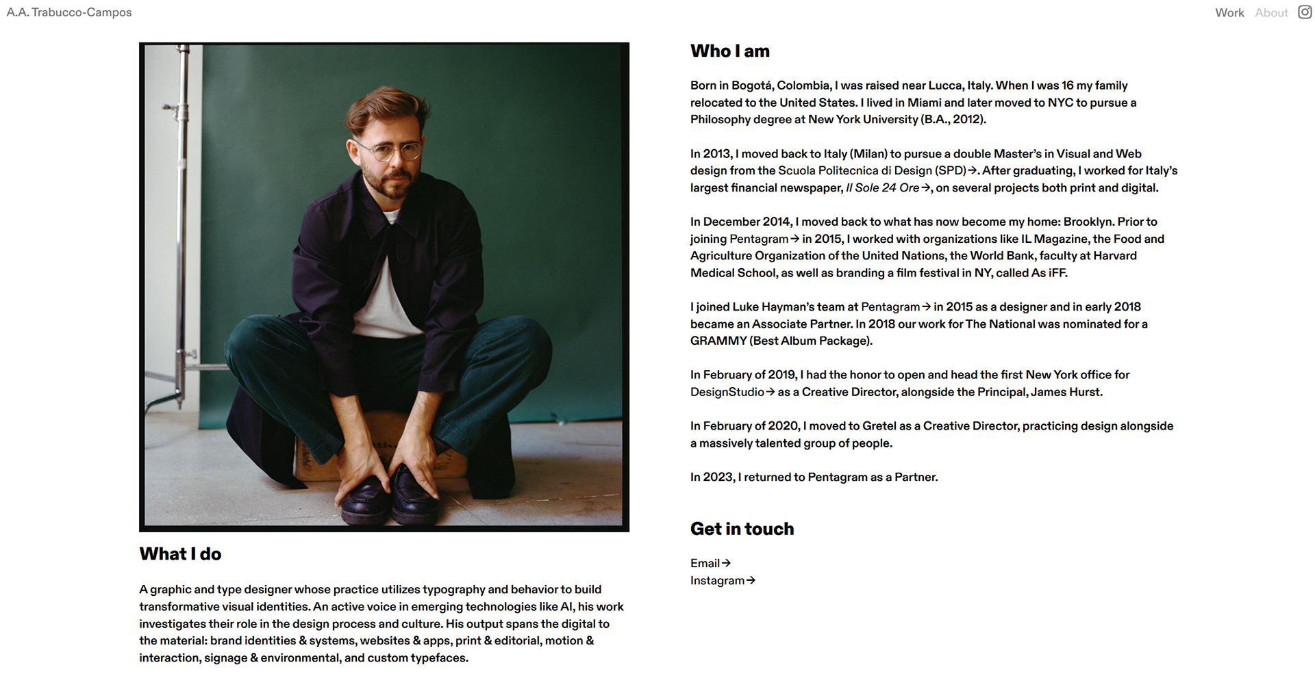
Andrea Trabucco's about page, simply writtent with clear sans typeface
Colour / mood
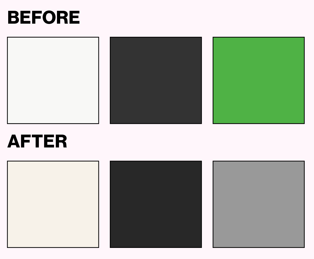
I kept a minimal approach, and working with limitation pushed me to choose three main colours. As you can see in my first prototype in the Layout section, my first decision was a white background with black text and green as the only accent.
That turned out to be a mistake once I started the new layout: the colours did not sit well together, and the green felt arbitrary, with no real design reason behind it.
My next decision was a creamy background as the main colour, which keeps the site professional while giving a sense of calm as you scroll. Black text keeps legibility high, and the accent became grey, the middle ground between white and black. It felt right to the eye across pages, and the idea was for the accent to pop without being distracting.
Logo / mark
For the logo I wanted something original that stands for my name. I did not want to set my initials in a random typeface, since that would not feel personal, so I decided to modify one myself using what I learned in previous modules.
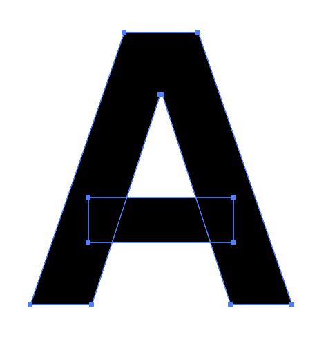
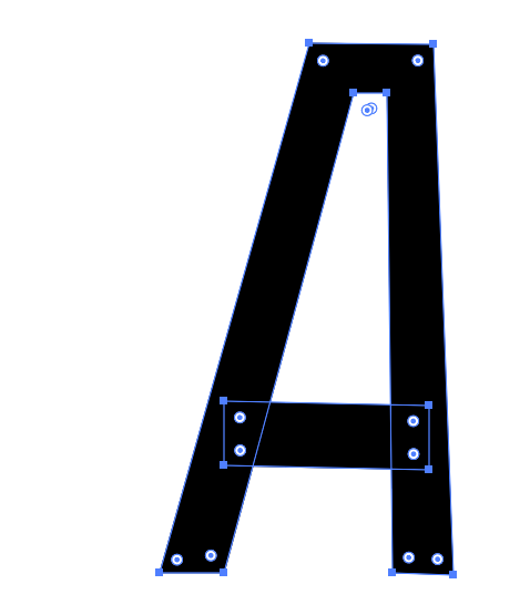
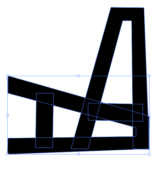
After trying different forms of the letter A (my name and surname both start with A), I rotated the letter to fit a square, and that gave me the idea for the mark: an abstract A that repeats across the logo.

Navigation
The navigation had to be intuitive. While editing the themes I noticed the menu text stayed fixed even when hovering or changing pages, which can leave a visitor unsure which page they are on or about to open.
To fix this I change the weight and colour on hover, and I keep the current page in a different colour so you always know where you are.
I separated the navigation from my social account, which I kept as Instagram only for a minimal feel and because it is the platform I actually use. The logo sits centred, small enough not to distract from the content.

About Page
Taking from Andrea Trabucco-Campos, I kept a short bio covering my path and ambitions, written professionally and in the third person when describing what I currently do.
I plan to add a portrait, like Chris Burkard's, showing only the face in black and white for a serious, confident image.
I also looked at Adham Dannaway: his tone did not speak to me, as he keeps it informal and jokes around, which works in a friendly setting but not when presenting your work, where a serious register makes a client more confident in your skills, especially at higher levels of investment. That said, the visual structure of his site and about page is far better arranged, thanks to his UI/UX skill.
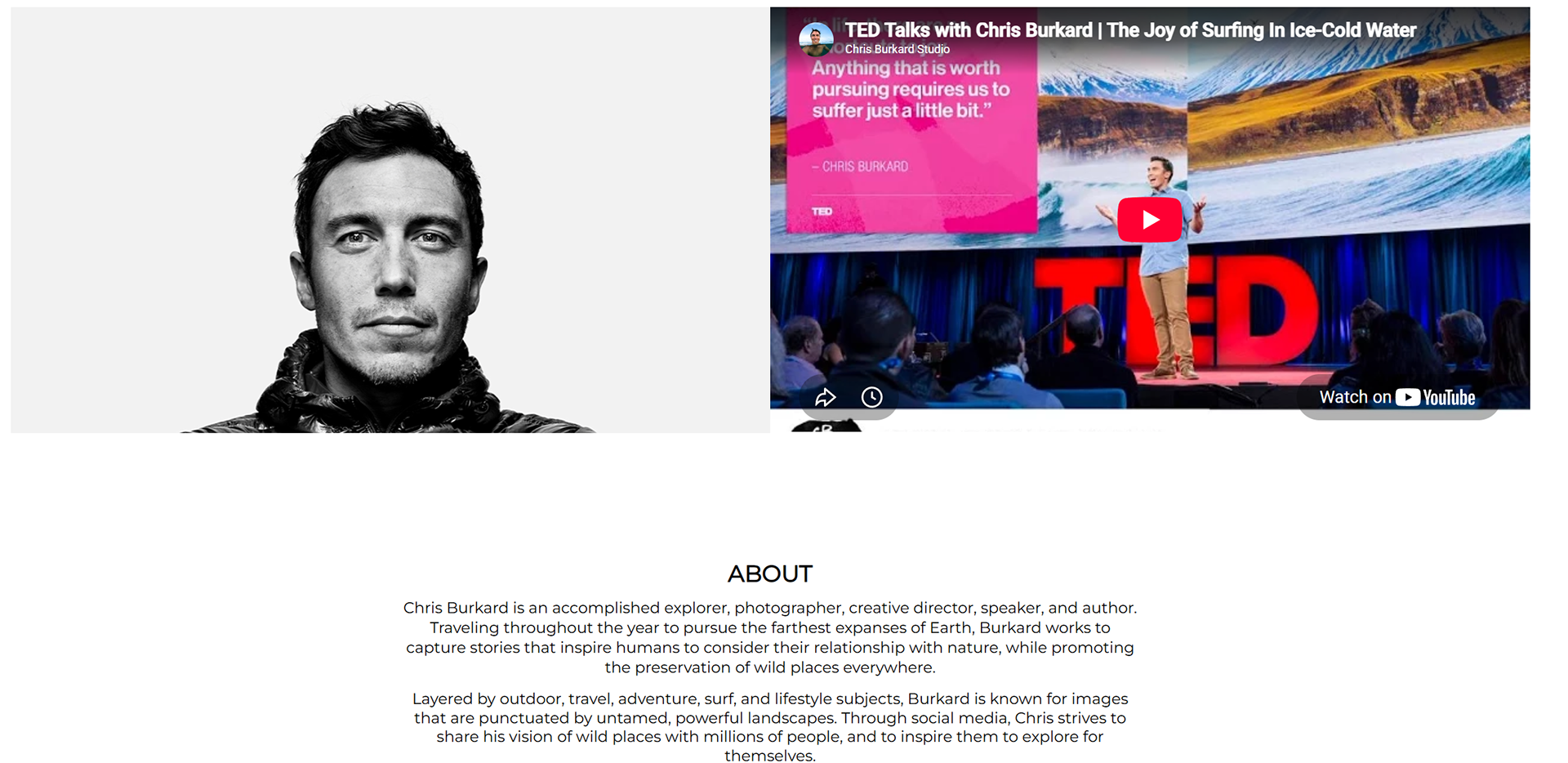
Chris buckard' About page
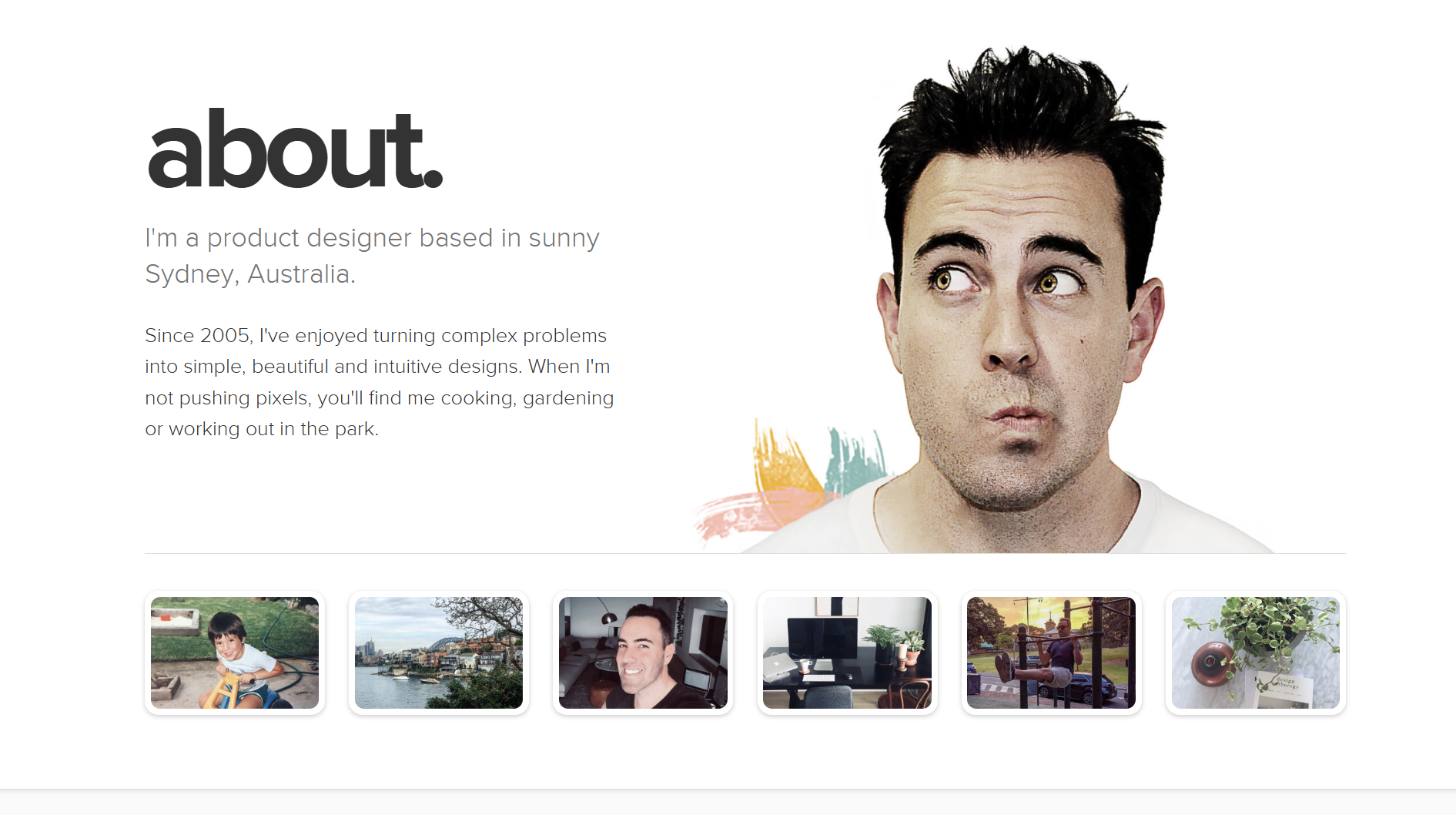
Adham Dannaway's About page
Contact + social strategy
I kept the contact form minimal. I do not think an email form gathers many enquiries: from what I have seen, people want to gather information quickly and move on, then contact you the moment they need you.
The form is more symbolic than anything, so I kept it, but I added my Instagram with a short caption so clients know I am one click away. That tends to work well, since people are often more at ease reaching out on social media than filling in a website form.
For social accounts, I now feel comfortable using Instagram only. It is my main point of contact and where I post after the site. This might look like a limitation, but it works in my favour: owning one platform reads as confident rather than desperate to be on every network, and it saves the time it would take to keep them all current. I saw that Andrea Trabucco-Campos does the same, and I took from that.


